Make this look in three steps
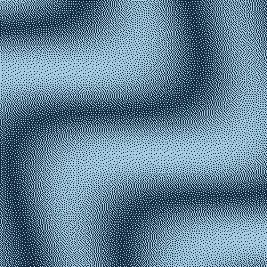
- Open the blue ribbon example with Floyd–Steinberg already selected.
- Keep Scale low enough to retain the source detail that matters. Compare the brightest and darkest areas before adding contrast.
- Choose your final colors, export and check for unwanted smoothing in the application where you place the image.
The four error weights in Make
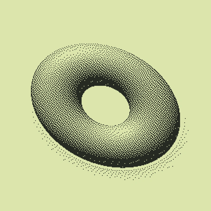
Make passes 7/16 of the error to the cell on the right, then 3/16, 5/16 and 1/16 to the below-left, below and below-right cells. These weights sum to one away from image boundaries. The renderer scans each row from left to right; it does not alternate the scan direction.
Why a smooth gradient still has texture
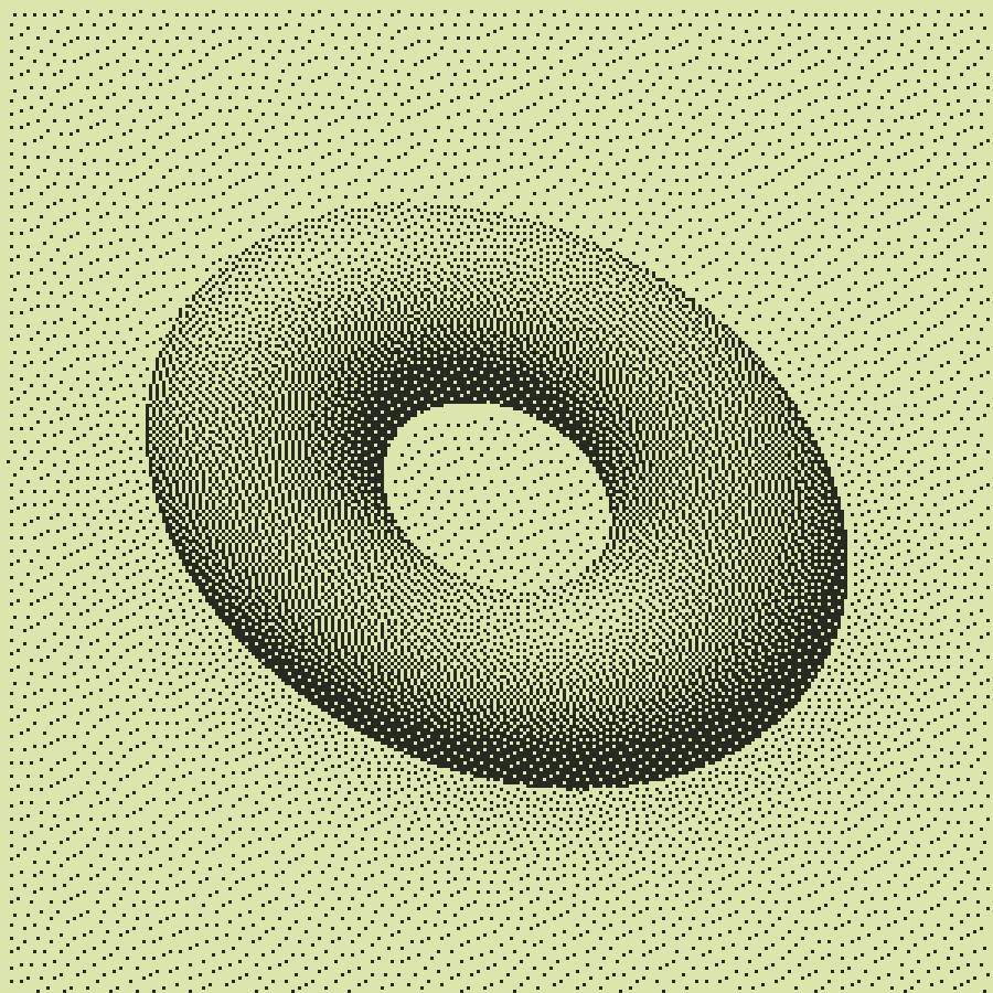
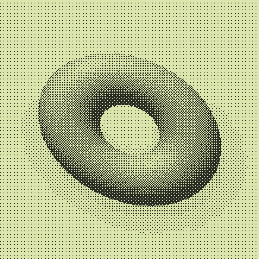
Intermediate tones are represented by the local balance of light and dark marks. A region looks smoother from a distance while its individual pixels remain visible close up. Some images reveal directional or worm-like structures. A lower scale or a different source contrast can change how noticeable those structures are.
Color is a separate choice
The blue example uses duotone after the dither pattern is rendered. In Make’s source-color mode, brightness still drives mark placement and foreground marks take their color from the source. This is not general-purpose indexed-palette quantization.
Free, Pro and your source files
Processing happens in your browser. Free image exports include 1× and 2× PNG and publish a small preview to the public community gallery. Pro skips gallery publication and adds 3× PNG, SVG and silent WebM video export. Use material you have the rights to upload.
Try it in Make ↗